User interface of product GeoAnalytics
Published on
Adaptive Layout & Accessibility
The Smart Indexes team follows design best practices when implementing the GeoAnalytics UI.
GeoAnalytics is built on WebKit-based browsers and features a fully responsive layout that adapts to different screen resolutions and device types in accordance with modern web standards.
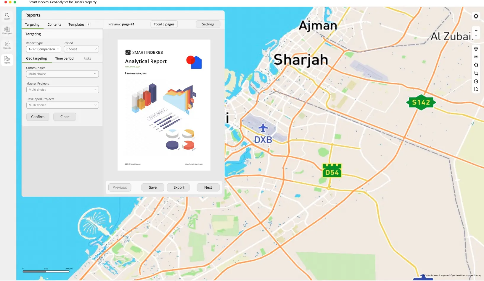 Tab Report Manager of GeoAnalytics
Key accessibility features include:
-
Responsive color schemes
High-contrast and theming options for improved readability.
-
Clear visual elements
Consistent iconography, labels, and focus indicators for keyboard navigation.
Branding & Loader
The interface is styled in the SMART INDEXES corporate design. During initial map loads, a custom "Loader" component displays an animated logo to provide feedback and reinforce brand identity.
 Visualization of the branding element loader
Analytics Tab
The main “Analytics” tab presents layered data visualizations and interactive summaries.
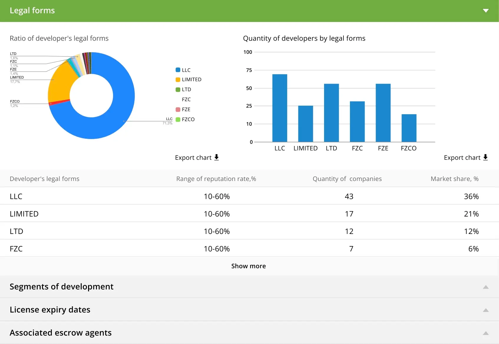 Tab Analytics of GeoAnalytics
For users available next features.
- Switch map layers (e.g., risk heatmaps, price indices, transport scores).
- View key metrics in a collapsible sidebar.
- Toggle between metric categories using a tabbed interface.
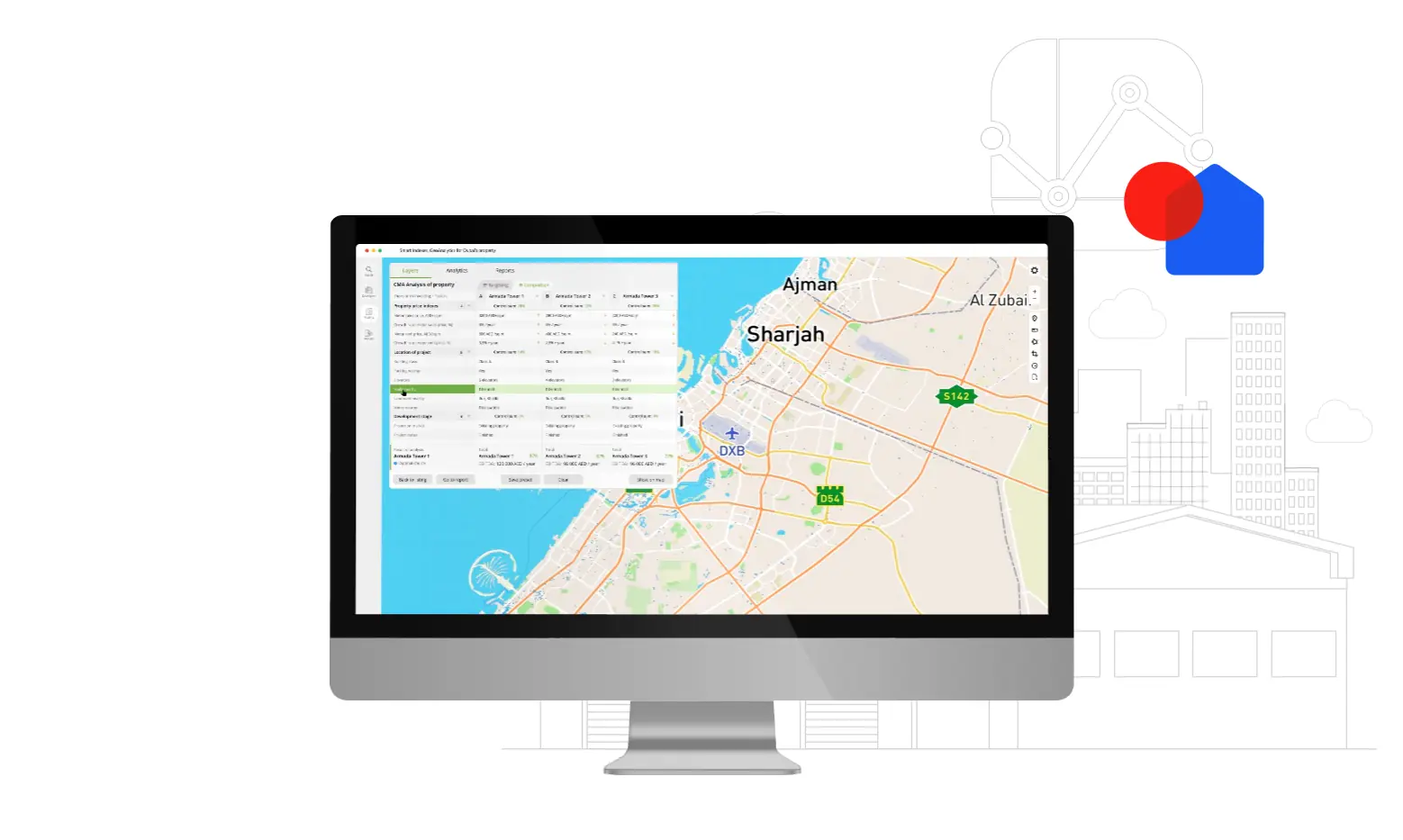
UI Components
GeoAnalytics provides a suite of custom UI controls for geospatial interaction:
-
Layer Panel
Turn data layers on/off and adjust opacity.
-
Toolbar
Access measurement tools, drawing tools, and export functions.
-
Tooltips
Hover or tap to reveal object-specific details (e.g., property attributes, risk scores).
-
Legend
Contextual color bars and symbols explain map data scales.
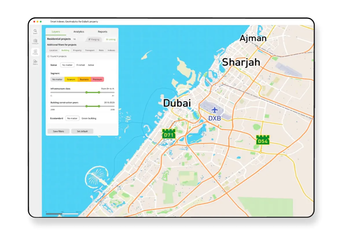
Color Palette
GeoAnalytics uses an intuitive color palette across its UI elements and map cartography to clearly distinguish positive and negative visual cues, ensuring a comfortable and accessible user experience.